June 03, 2010
April 26, 2010
{My Portfolio} A Color by Numbers Poster
This is a poster I just finished for the Digitas Health Employee Art Show held during Beer Friday. I feel like it could use a little something else, just not sure what yet..
Labels:
{My Portfolio}
April 22, 2010
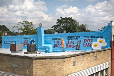
A Love Letter for You


Graffiti artist Steven Powers with the City of Philadelphia Mural Arts Program has created a series of more than 30 text based murals entitled "Love Letter ". Painted on the sides of buildings following the route of the Market -Frankford Elevated Line, the entire series can be seen for the price of one subway token. Steven, a West Philadelphia native, chose this neighborhood and this route because he wanted to bring messages of hope into a neighborhood where hope and positive thought is not the most common influence.
Labels:
Art + Form,
Designer + Illustrator,
Typographie
April 13, 2010
{My Portfolio} Doggie Style

This is a brand identity I created for Doggie Style, a contemporary dog grooming salon and boutique. The above images include: 1. Color Logo 2. Letterhead, Envelope (front and back) and Business Card
(Please click on the images to see details)
Labels:
{My Portfolio},
Identity
April 06, 2010
Betty meets Barbie: when Mad Men meets Mattel
I couldn't resist posting this "Barbie Dream House"... more like "Barbie's Dream Office". Although, depending on how you look at it, we spend more time in the office than we do at home, so maybe they are not so dissimilar...
Click for more details about the Mad Men Barbies.
Click for more details about the Mad Men Barbies.
Labels:
Just for fun
March 23, 2010
Pomme Chan
I'm loving her felt-tip pen line work and bright colors. Her hand lettering is also quite nice, so check it out.
Labels:
Designer + Illustrator
March 22, 2010
clay + glaze = love
These pieces are factory made, yet they still feel like they could be one of a kind. If only I could make pieces this uniform...
from Heath Ceramics
Labels:
Ceramics
March 02, 2010
The Chop Shop
The strong and delicate fonts intermingle with fine lines, sexy borders, delicate patterns and an incredibly fitting color pallet. Simply put, I couldn't leave anything out....
This meaty identity was done by Ptarmak. I highly suggest you check out the rest of their work.
Labels:
Identity,
Typographie
February 26, 2010
*BLING BLING*
With tiny details, bright colors, and fun designs from Old Gold Boutique, it's hard not to want all of these rings. You can buy one for me here.
Labels:
I want to wear that
February 04, 2010
Dreamy in shades of blue
How beautiful are these pieces by Cayetano Valenzuela? His use of color is dreamy, and his line drawn figures layered over painted backgrounds create an organic and organized chaos that I cant get enough of.
The pieces shown above are:
Alaska and the Circus New Year, 2008. Acrylic pen and pencil on wood.
Shadows that Stir, 2007. Acrylic pen and pencil on wood.
The pieces shown above are:
Alaska and the Circus New Year, 2008. Acrylic pen and pencil on wood.
Shadows that Stir, 2007. Acrylic pen and pencil on wood.
For more of his work check out his website.
Labels:
Designer + Illustrator
January 06, 2010
Martha Stewart + Real Weddings
For the first time, in the Winter 2010 issue of Martha Stewart Weddings, they featured a same sex wedding! I'm so proud of Martha Stewart for making a stand on this subject. In the media she is this very bright and strong woman that a LOT of people look up to. This is exactly what we need to remind the world that weddings are about love and not gender.
Labels:
Weddings
Subscribe to:
Comments (Atom)


